Frolick - Brand Design & Packaging
Brand Design | Logo Design | Package Design | Typography | Illustration | Adobe Illustrator | Adobe InDesign
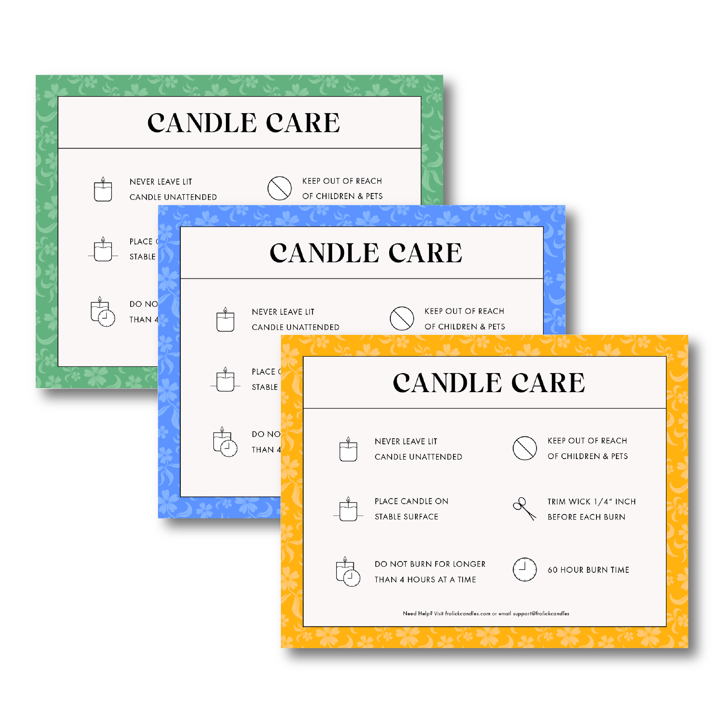
The brand identity for Frolick, a candle company that blends calm and playfulness through floral and herbal scents, draws inspiration from nature’s joyful energy. The design concept captures the essence of "frolicking" with dancing flowers, evoking freedom, lightness, and movement.
A custom logotype features a playful touch—the letter “i” resembles a candle wick, subtly reinforcing the brand’s purpose. A monochromatic color palette is tailored to each scent collection, reflecting natural elements and emotions: soft greens for herbal, warm yellows for citrus, and deep purples for florals.
Logo-inspired patterns add texture and depth, bringing the ‘frolicking’ theme to life. This layered approach creates a dynamic, cohesive visual identity that transforms everyday spaces into moments of tranquility and joy.


